

Programs Used:
Adobe Illustrator, Photoshop
Skills: Colour Theory | Visual Layout | Creative Planning | Branding& Identity | Typography | Merchandising
Duration: 1.5 months
The Harmony Music Festival was an individual academic project about PEI folk music festival. I started by developing the concept and designing the digital/print marketing, social, web and festival promotional assets required including the festival name, logo, colors, posters, and merchandise.
Story
Every summer, Cavendish, PEI, becomes the vibrant host of Harmony Folk Music, a festival showcasing island folk music. If you believe folk music lacks excitement, reconsider your perspective. Harmony transcends conventional folk, showcasing a variety of folk-inspired genres. It adopts a joyful, community-centered perspective, highlighting the notion of a vast, interconnected family closely connected to nature.
Color Choice
Drawing inspiration from the colors of the French River in PEI, this vibrant palette captures the spirit of the island’s natural beauty. The warm red, orange, and yellow evoke feelings of energy, passion, and creativity, while the cooler blue reflects the calming and soothing elements of ocean and sky. This color combination mirrors the diverse emotions that folk music can convey. Together, these colors embody the festival's themes of harmony, nature, connections, and community.

Logo Concept
Circular Shape
The choice of a round circle as the base of my logo is inherently symbolic of unity, continuity, and the cyclical nature of music, echoing the timeless quality of folk music traditions.

The Guitar Outline
I placed the guitar outline within the circle ties directly to the essence of folk music. The guitar is an iconic instrument within the genre and is synonymous with storytelling, cultural expression, and the intimate connection between artists and their audience.
F Symbol
The “F” symbol on top of the guitar signifies “Folk,” acting as a succinct yet powerful representation of the genre. This not only clarifies the festival’s musical focus but also adds a layer of simplicity and elegance to the design. Additionally, this logo is also used as a graphical element and patterns used across the marketing assets including posters and merchandise.
Typography
The choice of “Marvin” for the wordmark logo maintains a rustic and authentic feel, characteristic of folk music aesthetics. By replacing the “O” in “Harmony” with the festival’s logomark, it visually showcases the harmonious blend of tradition and modernity.
The selection of Berlin Sans FB as thesupplementary font for Marvin in this music festival design serves to enhancethe overall visual coherence and readability. Berlin Sans FB's balanced andversatile characteristics make it well-suited for secondary headlines and bodytexts on the festival posters, ensuring clarity and legibility withoutcompromising the festival's distinctive folk music aesthetics.

Posters Advertisement
In the promotional series of five posters for the Harmony Folk Music Festival, a gradient background in yellow-orange-green hues has been employed to evoke a natural ambiance that resonates with the essence (nature, warmth, energy, community, and connection)of the event. The deliberate placement of lush plants and leaves along the poster edges serves to establish a visual link between the music festival and nature, underscoring the festival's emphasis on closeness to nature and interconnectedness. Further more, the strategic use of folk music instruments as graphic elements on each poster ensures a consistent design theme throughout, enhancing the overall coherence of the promotional materials. This thoughtful integration of natural elements and musical motifs not only creates engaging visual appeal but also communicates the festival's core themes of harmony, nature, and connections to the audience.

The folk musicians in this festival were sketched with outlines and shapes, strategically positioned at the center of the poster, inducing a sense of mystery for viewers. The main poster features crucial details such as the festival's duration and venue, strategically placed in proximity to the secondary headline, ensuring viewer attention. Essential information, including the QR code for ticket purchase, is located beneath the main images. To convey a dynamic sense, blue-green waves are artfully placed in the top-left and bottom-right corners, symbolizing the surrounding ocean around the island. This poster design hopes to convey information in a natural and comfortable design style.
The Middle poster functioning as an additional poster complements the main design, offering comprehensive details about the performers and daily song lists throughout the festival. The use of a three-column layout improves the clarity and readability of the content. Moreover, the inclusion of a button-like box containing location details, ticket purchase information, and sponsor details ensures these key pieces of information are easily noticeable.

These three-square posters showcase individual musicians designated for each day's performance. Placed prominently at the center of each poster, the musicians are featured prominently, with their names boldly presented at the top center—a deliberate choice to highlight their significance.
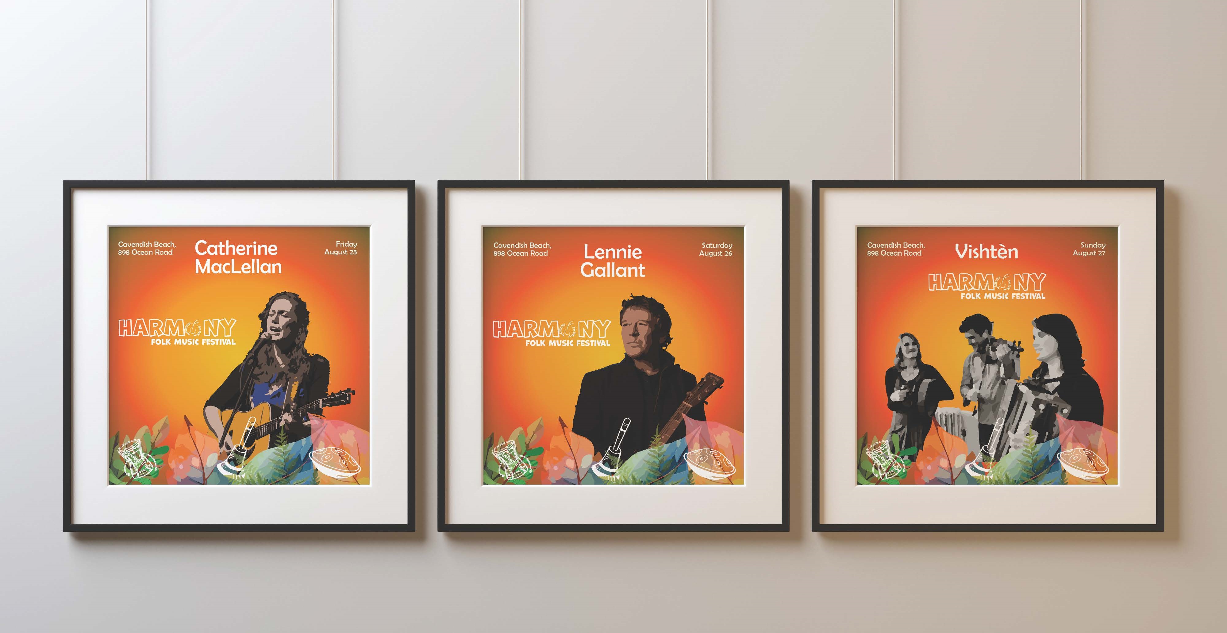
The festival and wordmark logo take a secondary position, strategically placed near the main image, ensuring a balanced visual hierarchy. Additionally, the location and date details are subtly positioned in the left and right corners, contributing to an overall harmonious and aesthetically pleasing design.

The tickets incorporate three primary colors from the overall design scheme. The3-day pass, situated in the top left corner, maintains consistency with the poster by using the same background color. Each ticket features the signatures of the musicians scheduled for that specific day, adding a personalized touch to the design.
In contrast, the one-day pass is designed with distinct colors, introducing a visual variety to enhance the overall aesthetic appeal and provide a more engaging experience for the audience.
This collection of poster designs aims to present festival information in a style that feels natural and inviting.
Merchandise
The creation of merchandise for this project involved the utilization of Adobe Illustrator and Photoshop. The colors and patterns incorporated into the merchandise were created based on the logo graphics and various other graphic elements present in this project.


You may also like


