

"Yan's Magic Oven" is an individual project about branding. It is a bakery branding for my own. Me myself has sweet teeth and my friends and families they love sweet goods too. When I came to study in Canada in 2015, I was settle down in a small peacefully island around east coast where there was no similar sweetness level goods as I had in China during that time, so I started trying baking for myself and for my friends who has same flavor as I. That is where the baking story started. Then few years gone, I went to bakery school to study how professional pastry journey was and get my pastry certificate. I also worked as pastry cook for a while. I hope in the future, I could own my own bakery shop, in my spare time, and only open on weekend or on my spare time. This is the brand I created for my future possible bakery shop.
Color Theory | Visual Layout | Creative Planning | Branding& Identity | Typography | Merchandising | packaging
The brand design for "Yan's Magic Oven" aims to radiate warmth and relaxation, creating a cozy ambiance for customers. With visually appealing elements and a comforting color palette, the design (the brand name, logo, color palette, typography, website design, social media advertisements) seeks to convey the artisanal touch behind each pastry, inviting patrons to indulge in a delightful and soothing experience.
Initially, my design challenge involved seamlessly integrating various baked goods elements into a single logo, reflecting the diverse offerings of my bakery shop, which includes bread, cakes, and various pastries. However, I realized that such complexity might not translate well into an effective logo. Given that cupcakes stand as the signature of my bakery brand, I ultimately opted to feature them prominently in the logo. The distinctive touch I aimed for is to set my cupcake logo apart from others. Leveraging the brand name, "Yan's Magic Oven," I creatively transformed the lower portion of the cupcakes to resemble the shape of an oven, adding a unique and memorable element to the design.
Adobe Photoshop, Adobe Illustrator, Figma
1 month
The logo prominently showcases the distinct shape of my bakery's signature cupcakes, integrating an oven silhouette to replace the bottom part. Adding a touch of symbolism, a ginkgo leaf adorns the top round of the logo, symbolizing the affiliation with Yan Studio, my broader brand house. This thoughtful design not only represents the unique essence of Yan's Magic Oven but also signifies its place within the larger Yan Studio brand family.

I designed a flyer an and a billboard ads to promote the bakery shop, featuring the location and a brief introduction to some of the products and services offered at the shop.


A variety of pastry patterns were designed for bag packaging to enhance visual appeal.

For box packaging, I did not use any pattern to keep it clean.


I developed a comprehensive 4-page website for this bakery brand, featuring Home, About, Products, Contact, and Testimonials sections. The background colors consist of orange and dark brown, complementing the logo and collectively conveying a warm and relaxing ambiance throughout the site.
I crafted a large cupcake surrounded by figures to symbolize the inspiration behind this brand, as mentioned in the introduction. The design captures the essence of myself and friends, all with a sweet tooth, coming together to share joy and delightful moments.

This page serves as the "About" section, narrating the evolution of this brand. Three carefully selected images visually depict the journey of the bakery shop's transformation—from its humble beginnings as a small home business, through collaborative efforts with friends, to its growth into a slightly larger scale enterprise.

The "Products" page begins with a prominent banner showcasing the signature cupcakes of this bakery shop. Below, various categories of bakery products are displayed in a clean and organized manner. The two-column layout, featuring text on the left and corresponding images on the right, ensures a visually appealing and streamlined viewing experience for visitors.

This contact page diverges from the conventional format with a distinct design approach. Incorporating a richer red color palette and featuring cartoon hands pointing towards the signature cupcake image, the aim is to cultivate a warm and inviting atmosphere, encouraging customers to freely express their thoughts or inquiries to our bakery. This unique design extends the lively and engaging style of the overall website.

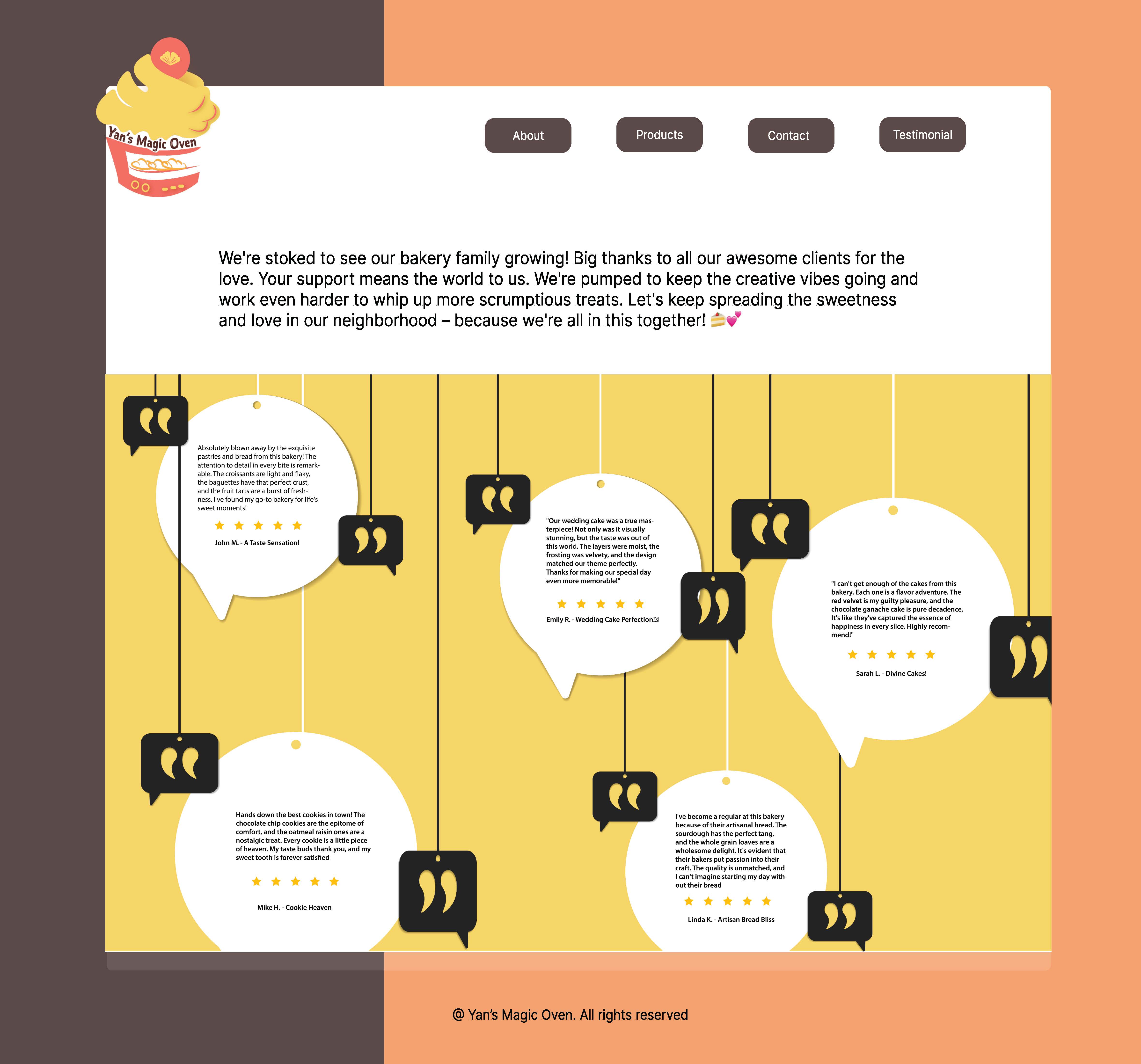
The final Testimonials page is crafted to showcase feedback from previous customers of the bakery shop. The dialogue boxes, suspended from left to right against a vibrant yellow background, are intentionally designed to seamlessly align with the lively brand aesthetic.

The mockups showcase the website's appearance on both a laptop and an iPad.
The stationary design of this bakery shop exudes a warm and inviting aesthetic. The use of light green round shapes as supplementary color of logo colors is to enhance the fresh and lively feeling. Elegant typography choices convey a perfect balance between a handcrafted charm and a modern, clean appeal, creating a memorable and delightful brand experience.


You may also like


