

Programs Used: Adobe Illustrator, Photoshop
Skills: Color Theory | Visual Layout | Creative Planning | Branding& Identity | Typography | Merchandising
Duration: 3 months
This is an individual academic project focusing on revitalizing a Vietnamese restaurant through rebranding.
Problem
The restaurant currently relies solely on plain text for its brand and lacks effective branding identity and promotional solution.
Design Goal
The objective of this redesign is to impart a modern and vibrant appearance, aiming to attract both loyal and new customers. The rebranding seeks to narrate or reinforce the restaurant's story, emphasizing its history, values, and journey. Additionally, the goal is to create a memorable and distinctive design that leaves a lasting impression on customers, thereby increasing the restaurant's recognizability and memorability. This is an individual academic project focusing on revitalizing a Vietnamese restaurant through rebranding.
About the Client - Song Huong Restaurant
History & Products
Established in 1996, Song Huong Restaurant in Vancouver has become a culinary treasure nestled in the Nanaimo Street area, seamlessly blending Vietnamese flavors into a rich tapestry. Throughout its extensive history, the restaurant has served as a haven for those craving an authentic taste of Vietnam, presenting a diverse menu that mirrors the country's culinary traditions.
Committed to using quality ingredients and adhering to traditional recipes, Song Huong Restaurant consistently delivers a memorable dining experience. From classic pho to delightful spring rolls, each dish reflects the restaurant's dedication to providing Vancouver's food enthusiasts with an authentic and delicious Vietnamese culinary journey.
Song Huong Noodles on Nanaimo Street invites customers to indulge in Vietnam's genuine flavors, offering a delectable menu featuring iconic dishes such as Pho, Banh Mi, and Bun Cha. Whether enjoying the robust broth of Pho or savoring the vibrant freshness of spring rolls, each dish serves as a flavorful exploration of Vietnam's culinary heritage, making Song Huong Noodles the gateway to an exquisite Vietnamese dining adventure.
Target Audience
New Brand
The revamped business name for this Vietnamese restaurant is now Song Huong Noodles, a departure from the previous Song Huong Restaurant. The shift in nomenclature is deliberate, aligning with the distinct culinary identity the establishment wishes to emphasize. The spotlight of Song Huong Noodles is directed towards its signature dish—various flavors of Pho, the iconic Vietnamese noodle with soup.
This rebranding seeks to communicate a refined focus on the restaurant’s specialty, aiming to etch a lasting impression in the minds of customers. By prominently featuring “Noodles” in the new name, the restaurant strives to convey its dedication to delivering an exceptional and diverse range of Pho options, inviting patrons to embark on a flavorful journey through the rich tapestry of Vietnamese noodle cuisine.
Keywords

Design
Primary Logo
I crafted this logo by extracting the initial capital letters from the words 'Song' and 'Huong'. Initially, I arranged them horizontally, but upon reflection, I realized a vertical alignment would enhance visual appeal further transformed the 'S', breaking it and shaping its lower part into a bowl filled with noodles, perfectly capturing the essence of the restaurant's main offering-Noodles. The 'H' was ingeniously transformed into chopsticks, symbolizing the authentic dining experience Song Huong Noodles provides. Additionally, the 'S' was stylized to resemble rising smoke, adding a touch of culinary charm. This design reflects the core elements of the Vietnamese cuisine and conveys the restaurant's unique identity.
Color Palette
Celebrating tradition and vibrancy, I keep the red from the original logo colors but make it brighter, which exude energy and welcome. Also, I added color yellow, comes from the lemons, which are always used as a condiment for Vietnamese dishes. Also, this color mirrors the golden shade of noodles, symbolizing joy and satisfaction. Together, the two colors with its tints encapsulate the restaurant’s warm hospitality and the delightful culinary experience that Song Huong Noodles offers.

Note
the Crimson Blaze #CC202F and the Golden Zest #CC202F are the dominant colors, which are always considered in using for logos, wordmarks and signage, etc. While the tints of Crimson Blaze and Golden Zest are mostly complimentary colors to the dominant colors.
Typography
I chose the Dapifer Stencil font for my logo design because of its unique and distinctive characteristics. The font’s fragmented appearance, with disconnected letters, perfectly mirrors the noodles of Song Huong, the Vietnamese restaurant. This font choice not only pays homage to the restaurant’s specialty, but it also encapsulates the spirit of creativity and uniqueness that defines our culinary offerings.
The choice to incorporate Franklin Gothic as my secondary font seamlessly complements Dapifer Stencil's bold presence in my design. While Dapifer Stencil commands attention and adds a touch of sophistication to our headlines, Franklin Gothic Medium, chosen for subheadings, maintains a harmonious balance. Its clean, modern lines and versatility enhance readability, ensuring that the key messages are delivered with clarity and impact. For the body text, Franklin Gothic Regular provides a consistent, professional look, ensuring a cohesive typographic hierarchy throughout our brand materials. This thoughtful combination of fonts not only reinforces our visual identity but also guarantees a polished and engaging reading experience for our audience.

Logo Variation
These logos are different versions of the brand. They can have different colors and uses. This way, the logo can be used in various situations without losing the brand’s original idea.

Logo Misuse
The logo of Song Huong noodles should be used with care. Any application of the logo is not within the proper usage shall be revised according to the style guide placed. Here are ways of misuse of the logo Song Huong noodles.

Logo Over Image
There are situations where in the logo will be placed above an image. With that it is important to remember a few rules to doing so. These rules are necessary in ensuring that the logo’s integrity will not be damaged when placed on an image.

Graphical Elements
Song Huong Noodles employs three graphic elements to design two distinct patterns, which serve as complementary visual elements for the brand. These patterns can be applied on packaging boxes, restaurant plates, cups, and other items.

Campaign Ads
In this visually stunning ad, I created a image with a generous portion of the signature noodles taking the center stage, tempting your taste buds with its savory aroma and delicious allure. To make the offer even more enticing, we’ve strategically placed a vibrant price tag adorned with our distinctive red and yellow logo on the left side of the bowl. This eye-catching element not only reflects the quality of our noodles but also assures customers that at Song Huong, you get sizable portions at a reasonable price.Our call to action, boldly presented with a “Order Now” directive in a larger font size, is strategically placed to guide and encourage customers to take immediate action. We want you to savor the satisfaction of our delectable noodles as soon as possible.

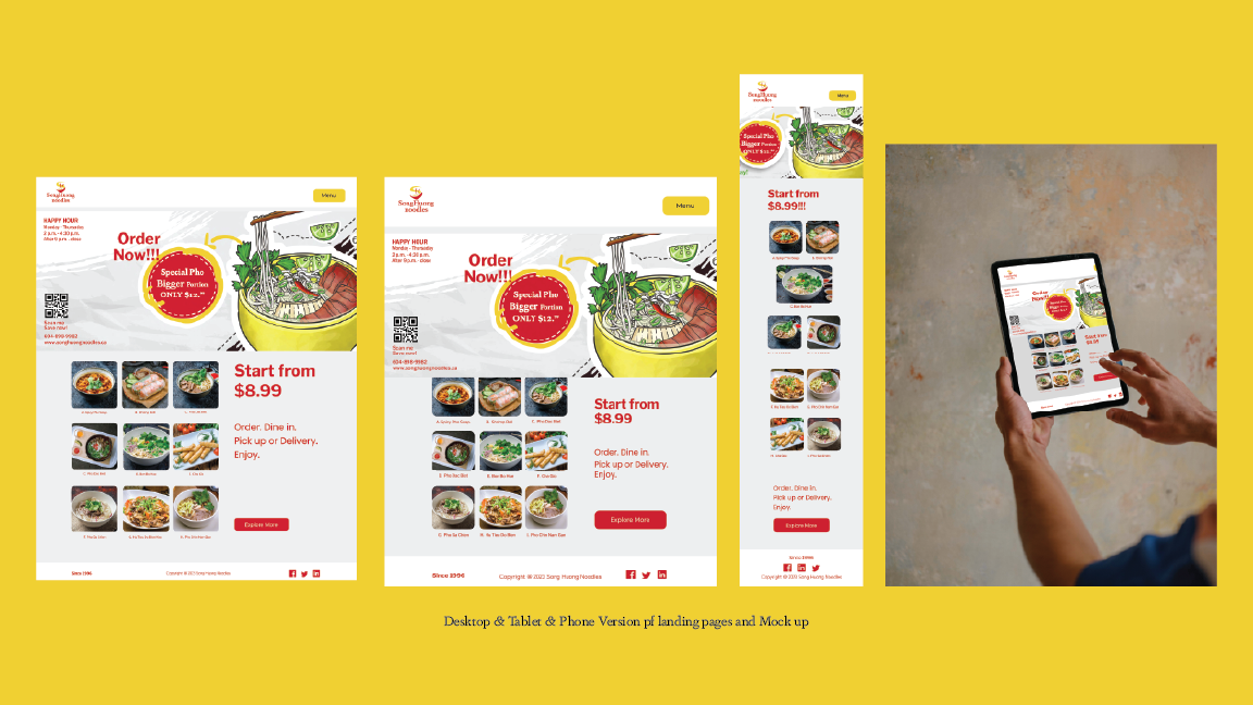
Landing Page
When customers scan the QR code on the campaign ads above, it will lead to the landing page. I created this landing page offering a compelling and visually enticing platform for potential customers, strategically leveraging key elements to drive engagement and conversions. The prominent advertisement showcasing generously portioned noodles at an affordable price serves as an immediate attention-grabber, appealing to cost-conscious consumers seeking value in their dining choices. The inclusion of nine square images featuring special and delectable dishes not only showcases the diverse culinary offerings but also caters to a broad spectrum of tastes, enhancing the restaurant's appeal. The strategic placement of the "starting from $8.99" text on the right establishes clear pricing information, instilling transparency and affordability. The vibrant red and yellow color scheme throughout the page ensures brand consistency, reinforcing recognition and recall. The effective call to action positioned under the price further propels potential customers towards the decision to order, creating a seamless and persuasive user experience that translates into increased online sales for the restaurant.
Stationary
This stationary represents the core branding materials for the brand’s usage. The incorporation of a noodle pattern in this mock-up serves as a visually engaging element, aiming to enhance the overall appeal and intrigue of the stationary package.

Custom Design
In the mock up samples, you can check out how the logo and typography appear.


You may also like


